top of page


JPGlobal - Sinutruk
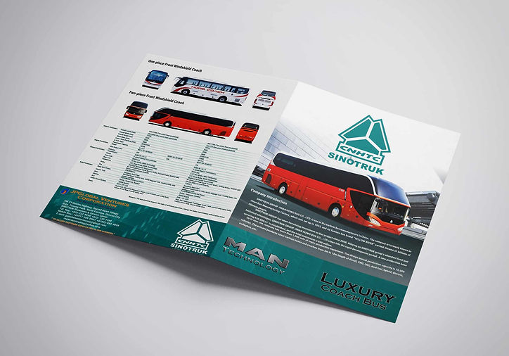
I was one of the two designers that handled this project and we were tasked to redesign / proofread the existing brochure for the client.
Problem / Challenges:
• existing brochure contains many typographical errors
• existing brochure is cluttered
• client preferred a very simple layout
• client is very specific in the fonts and alignment of the contents
We originally proposed studies with a dark look as we thought that it could bring a sophisticated look to the brand. It also implies masculinity as we are dealing with buses and trucks. Unfortunately the client did not like the idea and preferred a lighter and simpler output, thus the results.
Brochure Layout - MAN TECHNOLOGY
Brochure Layout - LUXURY COACH

Brochure Layout 1st Proposal
Billboard Mockup


bottom of page